Signs. They are generally worthless – they usually don’t get you votes… the primary purposes are usually to fire up volunteers and to establish a “presence” in the district being sought for election to…
There are some common-sense rules with campaign signs.
Don’t put your picture on your signs. There is no upside – only downside.
Make sure your name is the largest item on the sign.
Don’t use too many words. (7 or less is best…)
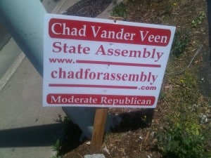
Here’s why – two of the worst signs I have ever seen made their debut in the AD-05 Race:
Too Many Words
Posted Crooked
“MODERATE REPUBLICAN”
Does this mean that Chad Vander Veen is going to be the type of deal-making Republican that raises taxes?
Perhaps he is calling himself a Moderate because that is how he thinks he can be different? Talk about helping Andy Pugno – please Chad spend more money on these…
Anyone thinking of voting for Vander Veen will think twice after seening this sign.
Next up: Quite possibly the worst sign I have ever seen…

“Donald Thompson for 5th District Assembly” – It has less than 7 words, but suffered at the editing table…
Can’t wait to see his ballot statement.
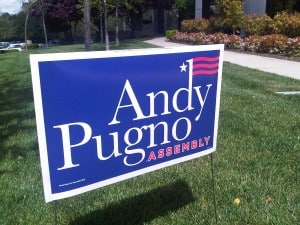
UPDATE – Here’s how to tell a professional candidate who is NOT marginal.
 Note – easy to see the name ANDY PUGNO.
Note – the Office Sought is boiled down to simplest terms.
Note – the Sign is more than one Color… in this case, two colors.
It is also in the middle of a lawn with great visibility versus being stuck next to a fence of the same color – or crookedly posted on a stick.
This concludes this lesson of Campaign Signs 101.


0 Comments